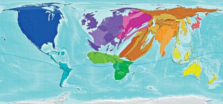
It's interesting to see how people are migrating across the globe. I came across this map thanks to Alexandra while we were socializing at the Frankfurt Girl Geek Dinner.
International immigrants
The size of each territory indicates the number of international immigrants living there. The United States receives the highest number of international immigrants, while Andorra has the highest proportion - four out of five people in Andorra are immigrants. The Philippines and Guyuna have the lowest proportion - just one in 500.
source: telegraph.co.uk, map from The Atlas of the Real World: Mapping the Way We Live by Daniel Dorling, Mark Newman and Anna Barford
I leave it to your appreciation. There are millions (ok, hundreds) of cool maps on World Mapper.


